scramberry
World in Progress
A vision for a fair digital future, Scramberry is redefining how people interact in Web3. Leading the brand strategy and creative direction, I built a visual identity and storytelling framework that makes blockchain technology more approachable, creating a brand that is as innovative as it is human. The brand’s core design elements—a square representing the digital world (pixel) and a circle symbolizing people—can be seen throughout all creative expressions.
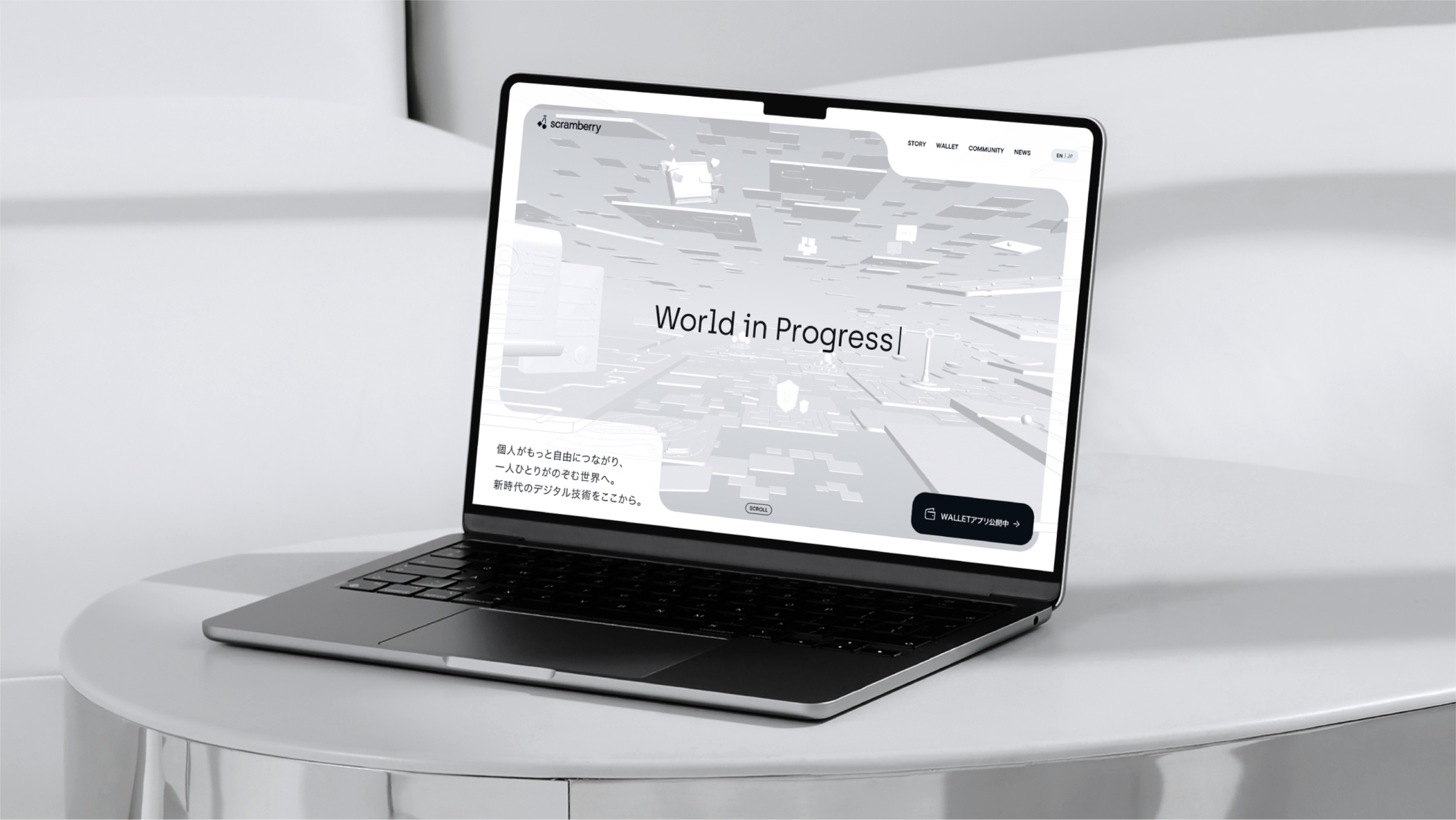
Website
-
Scramberry is built on the belief that everyone should have control over their digital world. As blockchain technology evolves, accessibility and trust are key in shaping the future of Web3. Leading brand strategy and creative direction, I developed a brand identity that bridges technology and human connection—where innovation feels intuitive, not intimidating.
At the core of Scramberry’s design language is a square, symbolizing the digital world (a pixel), and a circle, representing people. This motif runs consistently throughout all creative elements, reinforcing the brand’s philosophy of making technology more human-centered.
From logo design and brand language to digital experiences and messaging, every element was designed to make complexity feel simple. The challenge was to create a brand that feels both futuristic and inclusive, giving users the confidence to engage with Web3 without barriers. Scramberry’s identity reflects this balance—clean, bold, and forward-thinking, yet always centered around people.
-
Scramberryは、誰もがデジタル世界を自由にコントロールできる未来を目指すブランドです。ブロックチェーン技術が進化する中で、Web3をより身近で信頼できるものにすることが求められています。ブランド戦略とクリエイティブディレクションをリードし、テクノロジーと人間のつながりを結ぶブランドアイデンティティを構築しました。
Scramberryのデザインの核となるのは、デジタル世界(ピクセル)を象徴する「四角」と、人を象徴する「丸」というビジュアル要素です。このモチーフはすべてのクリエイティブに組み込まれ、テクノロジーをより人間的なものにするというブランドの哲学を表現しています。
ロゴデザイン、ブランド言語、デジタル体験、メッセージングに至るまで、あらゆる要素が「複雑なものをシンプルに」というビジョンのもと設計されています。未来的でありながら、白をベースにした包括的で誰もがアクセスしやすいブランドへ。Scramberryは、クリーンで力強く、先進的でありながら、常に「人」を中心に考えたブランドアイデンティティを確立しました。